Successful Digital Analytics Project Workflow

Successful Digital Analytics Project Workflow

How digital analytics people should get involved in a digital project ?

For every analytics project, every new digital campaign, new launch,… I usually go through those steps or some of them without noticing anymore. Recently Adobe released a new whitepaper “How to create a data-driven dynasty“, amoung other stuff this document was aiming to provide digital analytics practitioners best practices for a successful digital analytics program management. I found this chart below very useful and a keeper.

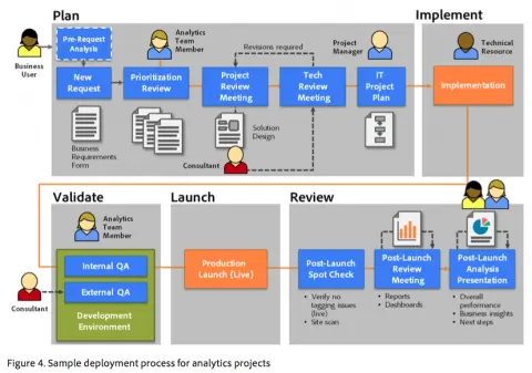
The chart “Analytics project workflow [copyright Adobe]” below is illustrating a successful workflow to an analytics project – assuming that every digital project is a also a analytics project :

From an agency perspective and from a client perspective as well, this digital analytics project workflow seems pretty ideal to make sure that analytics is always part of the equation and avoid the common pitfall where is analytics is involved after the launch – and most of the time it’s too late to get things right and meet the business owner expectations:

  1. Plan

  2. This step covers a critical processus when the business owner meet the analytics team to explain the campaign, launch… expectations from a business perspective. The analytics team will then translate the business requirements into a technical tagging guide for the IT team. This document will cover the basic tagging which are most of the time already implemented by default and especially the specific tagging related to the specific project mentionned (e.g. a microsite launch which main goal is its social interest to users: the main traffic metrics will be measured as well as the volume of login through social channels, the volume of shares…).

  3. Implement

  4. As simply as the title is saying, this step covers when the IT Team get clearly involved and implement the tagging. Depending on your ressources, the IT team maybe trained to the analytics tool you are using or not, as long as the analytics team is sensible to that, the implementation will go smoothly.

  5. Validate

  6. As for for every technical implementation, this part covers the testing on an testing environment before going LIVE. I’ll usually use tool such as httpfox and look at QueryString details to make sure that every thing is running smoothly, that the tags are fired when they should be, that the pageName is correct… this works with Google Analytis & Adobe SiteCatalyst.

  7. Launch

  8. Review

  9. Lastly, after reviewing the implementation live, making sure that you are capturing every data points that you need according to the business requirements, will come the time for reporting, analysis and possibly enhancements.
    This part is at last the one the business owner is awaiting for, it will allow him to know if and in which extend his campaign, launch… is successful, which channel driver is performing better, what actions are the users performing, what kind of improvements could be done… The analytics team will be the guarantee of data-driven decisions making.

What about you, does this analytics workflow sound good to you ? what kind of issues are you confronted in this process?

As usual thanks for reading me so far, if you liked this post, please spread the love…
Don’t make me think! Few simple and concrete web usability principles – Part 2

The 2nd half of the book and so the 2nd part of my article deals with the following subjects:

      1. How to get the best of your homepage design ?
      2. Why, When and How conduct usability testing?
      3. User-friendliness and Accessibility


Like in the 1st article, I’ll try to briefly expose what should be remembered from this book. It may not be 100% loyal to the book, 1st because of my interpretation and 2nd because I also express my own point of view.

1. How to get the best of your homepage design ?

Even if your homepage is not the first page that user will get through – it’s commonly known that an entry page is not always homepage, and the less it is the better as your landing page should be reflecting the path the user used to access your website.
Anyway, the homepage is still the page a user will go through during the navigation to have an overall impression, to look for guidance, to restart his navigation… That’s mainly why you need to make sure that on the homepage, people get it!
Here is what they should get:

      – an homepage should give the website identity and mission : a logo and an tagline should be enough – make it clear, short and it should convey differenciation and benefits
      – an homepage should show the website hierarchy : your navigation
      – an homepage should allow to search through a search box, shortcuts, teases and deals
      – an homepage should allow users to complete primary goals (sign up, registration to newsletter, fill a form for a free trial, …)

Your homepage should stay concise and understandable for any users and answers those:

      – what is this site?
      – what do they have?
      – what can I do here ?
      – why should I be here and not somewhere else?

The design of a website especially the homepage and main pages could be a very frustrating and conflicting process. Each team: design, IT, marketing, stakeholders, CEO… want to be a part of it which is certainly a good thing but when you get to a conflict of opinion – which may happen on every feature, every pixel, every color… “who hold the truth?“.
Hopefully, I can answer to this question : “Nobody” pfiouuuu, that’s a relief!

Nevertheless, the real question should be :”How can we realise this feature to provide a good user experience to our web users”. I would say by asking the web users their opinion & testing. This bring us to :

2. Why, When and How conduct usability testing?

I kind of already answer to the Why question, but let’s sum up the reason why you should conduct a usability testing:
Mostly because, using usability testing will improve your revenue through enhancing customer satisfaction & retention, but also:

      – if you want web users to complete the goals you have in mind when building your website, better to ask them directly if they get it or not! (the purpose, the value proposition, the concept, how it works…)
      – if you think that web users will use your website the way you build it for: you’re wrong!
      – if you want to avoid endless discussion with your team, please ask the web users to settle this for you
      – if you think that you are objective (and you’re better not be…): you’re wrong!
      – if you think this is useless: try once with neighbours, friends or anybody to browse the same website (with a similar goal for all : like buy a pair of Nike on Ebay for instance) and watch! You’ll be amazed!
      + it’s easy and fun to do

How not to do usability testing... (Image credit: blog.templatemonster.com)

First of all some guidelines of usability testing concept from Jakob Nielsen and a definition from Wikipedia:

Usability testing is a technique used in user-centered interaction design to evaluate a product by testing it on users. This can be seen as an irreplaceable usability practice, since it gives direct input on how real users use the system.


Here are few guidelines for testing:

      the sooner in your process the better
      – testing with one web user one is better than nothing
      – testing is an iterative process
      – 3 to 5 users is enough
      – don’t hold the testing because of problem to find the perfect tester- take “anybody” to test “if your grandma can use it an expert/ targeted audience will do”
      + most of all here the Steve Krug’s guide to conduct your testing.

1 rule that I think would be amazingly great, useful and revenue oriented: “Each web dev team should make once morning a month a usability testing and debrief over lunch”.

To conclude about usability testing, I think it’s really a great tool to increase user satisfaction and thus revenue, which finally is the goal in a ecommerce website :). Using usability testing is one tool among others, like AB Testing, Focus group, Card sorting… but each tool have a “perfect timing” during the process of building or enhancing your website.
This leads me to conclude on:

3. User-friendliness and Accessibility

Few guidelines to “behave” and make your web users happy:

      – don’t ask for useless or really annoying form fields: this will lead the users to ask himself why are you asking him those informations and either he will lie or he will quit
      do not hide informations from the users: anything you would want to hide thinking that you can “trick” the web user in filling in registration form first, hold it!
      – no marketing only flash slide intro… which get on the user way to accomplish something
      – do not punish the user for not filling exactly how you think they should – for instance don’t erase all the credit card information because the cardholder name is missing (you should adapt to the web user not the opposite)
      do everything to make the web user navigation on your website easy!

Accessibility meaning that people with disabilities can use the Web is considered as part of usability.
I’ll not dig into too many details for this part as there are already a lot of guidelines online about this subject and the rules to follow.
Nevertheless here is a quick list, you can follow:

      make things usable for everyone will help users w/ disabilities (fixing common issues)
      – use CSS and allow your text to resize
      add alt text to every image & link
      – make your forms work with screen readers
      – make all content accessible by keyboard
      – use client-side image map

That’s it for today (and for the book also)!
You can go on with reading the following book of Steve Krugs “Rocket Surgery Made Easy” (focus on Usability Testing) and also follow his work on www.sensible.com.

From my point of view, this book is a good reminder of a lot of usability guidelines we easily forget and also a great great guide to do some usability testing! I hope this will help you too and lead you to pick some tips, buy the book or conduct some usability testing!

Sangomar 2012, a lead generation oriented website!

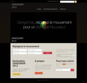
Sangomar2012.com is a website I created for a friend. This website was created on Senegal presidential election occasion to engage the senegalese youth to vote!

I am certainly not a developer, but I really cannot hold on looking into the code, trying to code some stuff myself particularly as WordPress is really easy-going and flexible and also because my companion is web developer… so if I mess things up – as it often happens he could say – he can fix it!
Anyway, don’t want to bother you with my personal life, I just wanted to introduce my last “freelancer” website project Sangomar2012!
One of the reason why, I’ve been kind on lazy those last weeks on the blog, I was doing a website WordPress based for a friend. My friend choosed a wordpress compatible template + his domain and I took care of setting up the website for him. In few words, it was for me the occasion to build from scratch a website with WordPress (except for my blog).

      – From my friend/client point of view, this website was meant to promote and engage young senegalese to vote during the last election. As you may know, we just get the final results a few days ago.
      – From a webmarketer point of view, the main goal of this website is lead generation that’s why I put my effort in making the newsletter subscription form prominent and redundant but not too overwhelming. I used both Google Feedburner email & RSS feed functionalities and also a simple php based form.


I tried to gather the best WP plugins for his needs and also for my curiosity, here is the list of plugin I used to implement the functionalities needed according to the website main objective.

  1. Google Analytics for WordPress, impossible for me not to… I’m too curious
  2. Really simple Facebook Twitter share buttons
  3. HeadSpace2, for SEO purpose to customize page title, description…
  4. SEO Smart Links, also for SEO pupose a great plugin to promote internal links
  5. Simple Google Sitemap XML
  6. Google Feedburner

Very few compared to the list of plugins I’m using for this blog ! This website is my very fisrt one on my own, please feel free to comment, to criticise as long at it can help me to improve…

Allow me to make an aparthe, I’m pretty happy that I spend some time on this website as besides being one of my friend website, this website echoed my personal opinion about why vote is important!

Don’t make me think! Few simple and concrete web usability principles – Part 1

Finally, I saved some time to read this very useful and quite short book! This book of Steve Krug, web usability expert and consultant, is a nice way to find simple tips to check you website with fresh eyes and easily pinpoint what should be improved and how final users may think it’s improvable (user-oriented)! And also, it has great guidelines for a revamp or website creation.

The subheadline of this book “A Common Sense Approach to Web Usability” is fully adequate to what it is :). It’s mostly basic stuff but most of those basics are so basic that we tend to overfly them. Reading this book, remind me 2 principles : “Back to the Basics” & “Keep it simple, s“.

In this first article about this book, I’ll go through what I think should be remembered from the first 6 chapters (half of the entire book) in 10 points. Sorry if sometimes, it feels pretty obvious but nevertheless even the obvious is good to be remind of!

Knowing that when we/people use the web:

      ~ People scan web page and do not read all the content of a web page
      ~ People are looking for keyword because we (people) know we dont need to read everything we are just reaching for what we are looking for
      ~ When browsing, people dont search for the best option but for the most reasonable option
      ~ We muddle through as we don’t care about understding, we care about getting to our point

Here are my 10 usabilty guidelines:

      1. Copy, Call-to-action, Headline… : Make it obvious, self evident or at leat self explanatory!
      2. Create a clear visual hierarchy: the more important = the more proeminent
      3. Create a clear visual hierarchy: things related logically are related visually (color, font…)
      4. Use conventions: make it obvious that a call-to-action is clikable | Keep the visual noise down
      5. No needless word get rid of 3/4 of your content
      6. Navigation: give the user something to hold on. Good navigation give us confidence in the website builder
      7. Follow the conventions: Persistent navigation must be including return home, search box, login, category…
      8. Follow the conventions: This persistent navigation should be everywhere exept homepage & checkout
      9. Every page need a name, the name should be the same as the link which take the user on the page or at least match maximum keyword
      10. Exercise… Quick test for a good navigation: At a glance on your pages, Answer to:
      – What’s the site id (logo)
      – On which page am I (page name)
      – What are the major section of the website
      – What are my navigation option at this level
      – How can I search

If you want to go deeper, and you should, read this book: Don’t Make Me Think – A Common Sense Approach to Web Usability. And you can also wait for Part 2 of this article!

Usability Testing : Card sorting ou Tri de cartes

[:fr]Methodologie Tri de cartes La refonte de votre site web s’impose ? Vous vous interrogez sur la structure de l’information de votre futur site web ? La navigation de votre site est surchargée ? Vous cherchez un moyen d’améliorer l’expérience utilisateur sur votre site ?…

Les avis en interne pour ce genre de questions sont en général légions et pour ne pas finir en guerre de tranchées ou être contraint de se plier a l’avis de l’HIPPO , une méthodologie différente du brainstorming interne s’impose.

Avez-vous déjà essaye le tri de cartes ? Si non, voici pourquoi vous devriez l’utiliser :
#1 : Il s’agit d’une méthodologie user-oriented
#2 : C’est simple et peu couteux a mettre en place
#3 : C’est reconnu et fiable : si Jakob Nielsen, le dit…
#4 : C’est ludique (oui, c’est un argument 🙂 !)

Qu’est ce que la methodo du tri de cartes ?
Il s’agit d’une méthodologie qui consiste a demander a l’utilisateur final d’organiser les contenus de votre site, qui auront été labellises séparément sur chacun une carte au préalable, en fonction de la façon dont il voit les choses.
Cette technique vous permet de voir l’architecture de l’information telle qu’elle devrait être selon l’utilisateur final – bien sur, il ne s’agit pas de la reprendre tel quelle mais de s’en inspirer et d’avoir un aperçu de comment l’utilisateur va utiliser votre site. Et aussi, cette technique va vous permettre de tester les labels et les améliorer en fonction du degré de compréhension de vos testeurs.

Comment ça marche le tri de cartes ? 2 méthodes :
Le tri de cartes ouvert qui consiste a donner les cartes aux testeurs sans aucune notion d’architecture primaire du site.
Le tri de cartes ferme qui consiste a donner les cartes aux testeurs avec les grandes catégories primaires pré-etablies.

Le choix entre ces 2 méthodes va dépendre de l’état d’avancement de votre projet et surtout de vos objectifs : pour une création de site, j’aurais tendance a rester ouvert puis a fermer dans un deuxième temps pour gagner en précision et pour une refonte ou l’ajout de nouvelles catégories, j’opterais pour la technique fermée.

La mise en place du test :
# 15 personnes (Card Sorting: How Many Users to Test), 5 groupes de 3 personnes
# Tester les labels avant de tester l’architecture
# 30 a 100 cartes
# la modération du jeu est a ne pas négliger : ne pas laisser un participant prendre le lead sur les autres, s’assurer que chaque utilisateur puisse dire ce qu’il a a dire…
# l’analyse du test est time-consuming mais a prendre avec serieux

Y’a plus qu’a tester !

[:en]
Your website is dying for a revamp, redesign? You need to determine the most suitable web structure? The navigation of your site is overloaded? Looking for a way to improve the user experience on your website? …

Internal opinions about those questions can be overwhelming and if you do not want to end up in warfare or to be compelled to bow to the opinion of the HIPPO, a different methodology from internal brainstorming is advised.

Have you tried the card sorting methodology ? If not, here’s why you should give it a try:
# 1: This is a user-oriented methodology
# 2: It’s simple and inexpensive to implement
# 3: It’s recognized and reliable: if Jakob Nielsen, says …
# 4: It’s fun (yes, that’s an argument:)!)


What is the methodology of card sorting?

The process involves users to sort a series of cards, each labeled with a piece of content, into groups that make sense to them.
This methodology leads you to understand the organisation of your content as it should be according to your final users – of course you should not just copy/paste the results, but you should get inspiration from there and it will give you a overview of how the user will use your site, for real. Also, this technique will allow you to test the labels/your copy and improve the degree of understanding of your testers.

How does card sorting work? Two methods:
Open Card Sorting: users by group of 5 are given cards showing site content with no pre-established groupings, no notion of primary architecture of the site.
Closed Card Sorting: users by group of 5 are given cards showing site content with the primary architecture of the site.

The choice between these two methods will depend on first your goals then the progress of your project. For example if your are creating a new a website, I would tend to stay open and then use closed technique to increase accuracy and regarding redesign or addition of new categories, I would opt for the closed technique.

The implementation of the test:
# 15 people (Card Sorting: How Many Users to Test), 3 groups of 5
# Test labels before testing architecture
# 30 has 100 cards
# Moderation is to keep in mind: do not allow a participant to take the lead over the others, ensure that each user can say what they want to say…
# Analysis of the test is time-consuming but to be taken seriously

Time to try it !