Digital Analytics, Back to School ! 2 must-read

Digital Analytics, Back to School ! 2 must-read

What’s in this post: 2 Books recommendations – Summer read for Digital Analytics addict: Fundamentals in Digital Analytics & broader Customer centric view

It’s been a few weeks since summer is over and we are now in Back to School mood, showing off our nice pic and how tanned we are… And here comes the fateful question “What did you do this summer?”. Well, now that I am a full grown up and am living in Asia – I don’t really get this feeling of end of Summer in September, as it’s still 30 degrees in Hong Kong and it’s not going to stop before November approximately and I don’t really get the fateful question anymore as in Asia July/August are month like any other ; the activity is not slower.
Calvin-book-reportAnyhow, I don’t blog in July/August and treat September as my Back to Blogging month. And instead of showing off how tanned I am, I’ll show off how studious I was this summer and share 2 books I read during my trip back to Europe this summer.

  1. Web Analytics: An Hour a Day (2007) – Author: Avinash Kaushik
  2. It Only Looks Like Magic: The Power of Big Data and Customer-Centric Digital Analytics (2013) – Authors: Jennifer Veesenmeyer, Peter Vandre, Ron Park and Andy Fisher (MERKLE)

Back to the basics with Avinash! “Web Analytics: An Hour a Day”

I had this book since a while in my bookshelf, over 5 years to be honest – eyeing me and vice versa – I finally got to read it ! Holidays and long hours flight are the best. Even if it has been published a while ago, Web analytics, one hour a day is a great book full of insights, supposedly destined to beginners but even for advanced analytics expert I believe it’s always good to take a step back and make sure that you master your basics. As this is still 400 pages to digest, and my memory would never be as organized as my Mac, I took some notes and highlighted my favorite passages of the book along the way so that I can make a book report of it later.

analytics_hour_a_day Web Analytics: An Hour a Day
Author(s) Avinash Kaushik
Summary If you are a tiny bit interested by the digital analytics world, you would have heard of Avinash Kaushik. His blog is full of ressources and when I started working in the field I spent hours reading through his posts and still do, his book – which has been renewed since this 2007 version, is a good deep dive into Digital Analytics. Avinash share his thoughts about multiple topics: data collection, data-driven organization and analytics skills and fundamentals. Even though the title mentions Web analytics, it’s not an under statement to say that beyond website analytics ; you’ll learn about search analytics, market research, testing, statiscal concepts inherent to analytics and optimization…
Best parts & tips
  1. Reporting and KPI: This section covers the best practices to do great reporting, with the best advices of all “start with desired outcomes, not reports”. In a nutshell, the author explains that the best way to design your report is to first and foremost think ahead of your strategy: what is your website goal? what is each of your pages goal is the overall strategy, starting from there you’ll design a better tagging implementation and a better report. This echoes pretty well to my article: Successful Digital Analytics Project Workflow
  2. The power of benchmarks and survey: Benchmarking and surveys are great tools to expand your measurement insights. Avinash mentions several examples of how to leverage them and why they are so useful. Benchmarking either internal or external are crucial to put context around your metrics, it’s a better way to tell the story of your figures. Some tools are listed in different sections to achieve that such as Hitwise, ComScore, Alexa…
  3. Statistical significance and Calculating Control limits: We are often challenged by our clients about the data, there is deep feeling of mistrust around the data delivered especially when the results goes against a personal opinion. And even if you are not challenged, it’s should be a core part of your own work to challenge your results and be absolutely convinced by what you are presenting. In diverse part of this book, you’ll find tools and examples of how to achieve this and rely on tangible tools to demonstrate how much your data and reports can be trusted: statistical significance calculator, sample size calculator… are some of them.
  4. I just cited a few of what’s available and was at that time relevant to me but there is more… I won’t spoil you the rest of the reading… and more especially I would advise to read the 2.0 version “Web Analytics 2.0: The Art of Online Accountability and Science of Customer Centricity

I still had a few hours flight left to burn and decided to continue my reading journey… Digital Analytics is a moving discipline and there is always to learn. So I devoted my time to this other fantastic book focusing on

advanced customer centric analytics “It Only Looks Like Magic: The Power of Big Data and Customer-Centric Digital Analytics”

The title though quite self explanatory do not give the full view of what to expect. In 168 pages, you will go through a pretty comprehensive view of steps and consideration to have when embarking into a customer centric approach to pilot your business.

it only looks It Only Looks Like Magic: The Power of Big Data and Customer-Centric Digital Analytics
Author(s) Jennifer Veesenmeyer, Peter Vandre, Ron Park and Andy Fisher (MERKLE)
Summary In their own words, the purpose of this book is to “enlighten analytic minds to the power of a fully coordinated effort to use multi-channel data to drive insights, measurement and decisioning that create optimal outcomes“. This book covers multiple notions essential to achieve this goal: best practices to capture data in a multi-channel, multi-devices/screen world, pitfalls that you’ll encounter but also top notions and basics to master before kicking off a customer centric project. Which parties should be involved, at what time and why… How to work with your IT folks, which tools and strategy to consider (MMM, Attribution, Segmentation, Optimization and Testing) etc… How different media channels are connected and what can be achieved in this mindset.
Best parts & tips
  1. Data capture: How to create an optimized cross-channel tracking ? In this section of the book, the authors point out a very important and well-know challenge of defining a unique identifier that can be used across your different data sources. This exercise is quite challenging as we know we don’t always have all access to the details of one individual in one place. How do we connect individual activity outside the website to activities onsite when the user is not identifiable – which identifiers are strong identifiers (cookies, email, telephone, IP, visitor ID…)
  2. Effective email data integration strategy, this section emphasis the importance of email data. Emailing being one of the best tool to capture individual information with the conscious agreement of the person ; it’s crucial to take advantage of this channel to better connect offline and online data. Even though emailing often comes at the end of the journey this is the chance to maximize knowledge of our customers.
  3. Mix modelling and Attribution: Top down versus Bottom up approaches. This section covers both approaches and how each of them contribute to measuring your marketing performance, but also the limitations of each of those solutions and how bad interpretation/utilization of those tools may conduct to bad media optimization strategy and why market research can supplement to a combined approach for a better “truth”.
  4. Predictive analytics, Controlled testing… I won’t spoil you the rest of the reading…

I really enjoyed those 2 books for 2 major reasons : (1) The concept and examples are really close to real business questions we have as digital analyst, both books rely on real-life scenario and do not bore you with new fuzzy and trendy concept that won’t help your daily working life. Also those books provide tools, links, how-to, case studies… you’ll finish your reading with a sense of having learnt something new and having the tools at hand to apply it (2) No linear reading. You can cherry pick the topics that interest you and read only 2 chapters if you want, although I will suggest to read it all, some chapters may not be relevant to you either because you already master it or because you just don’t need that level of details.
Hope you’ll enjoy the reading !

If you liked this article, spread the data-love…

Don’t make me think! Few simple and concrete web usability principles – Part 2

The 2nd half of the book and so the 2nd part of my article deals with the following subjects:

      1. How to get the best of your homepage design ?
      2. Why, When and How conduct usability testing?
      3. User-friendliness and Accessibility


Like in the 1st article, I’ll try to briefly expose what should be remembered from this book. It may not be 100% loyal to the book, 1st because of my interpretation and 2nd because I also express my own point of view.

1. How to get the best of your homepage design ?

Even if your homepage is not the first page that user will get through – it’s commonly known that an entry page is not always homepage, and the less it is the better as your landing page should be reflecting the path the user used to access your website.
Anyway, the homepage is still the page a user will go through during the navigation to have an overall impression, to look for guidance, to restart his navigation… That’s mainly why you need to make sure that on the homepage, people get it!
Here is what they should get:

      – an homepage should give the website identity and mission : a logo and an tagline should be enough – make it clear, short and it should convey differenciation and benefits
      – an homepage should show the website hierarchy : your navigation
      – an homepage should allow to search through a search box, shortcuts, teases and deals
      – an homepage should allow users to complete primary goals (sign up, registration to newsletter, fill a form for a free trial, …)

Your homepage should stay concise and understandable for any users and answers those:

      – what is this site?
      – what do they have?
      – what can I do here ?
      – why should I be here and not somewhere else?

The design of a website especially the homepage and main pages could be a very frustrating and conflicting process. Each team: design, IT, marketing, stakeholders, CEO… want to be a part of it which is certainly a good thing but when you get to a conflict of opinion – which may happen on every feature, every pixel, every color… “who hold the truth?“.
Hopefully, I can answer to this question : “Nobody” pfiouuuu, that’s a relief!

Nevertheless, the real question should be :”How can we realise this feature to provide a good user experience to our web users”. I would say by asking the web users their opinion & testing. This bring us to :

2. Why, When and How conduct usability testing?

I kind of already answer to the Why question, but let’s sum up the reason why you should conduct a usability testing:
Mostly because, using usability testing will improve your revenue through enhancing customer satisfaction & retention, but also:

      – if you want web users to complete the goals you have in mind when building your website, better to ask them directly if they get it or not! (the purpose, the value proposition, the concept, how it works…)
      – if you think that web users will use your website the way you build it for: you’re wrong!
      – if you want to avoid endless discussion with your team, please ask the web users to settle this for you
      – if you think that you are objective (and you’re better not be…): you’re wrong!
      – if you think this is useless: try once with neighbours, friends or anybody to browse the same website (with a similar goal for all : like buy a pair of Nike on Ebay for instance) and watch! You’ll be amazed!
      + it’s easy and fun to do

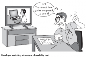
How not to do usability testing... (Image credit: blog.templatemonster.com)

First of all some guidelines of usability testing concept from Jakob Nielsen and a definition from Wikipedia:

Usability testing is a technique used in user-centered interaction design to evaluate a product by testing it on users. This can be seen as an irreplaceable usability practice, since it gives direct input on how real users use the system.


Here are few guidelines for testing:

      the sooner in your process the better
      – testing with one web user one is better than nothing
      – testing is an iterative process
      – 3 to 5 users is enough
      – don’t hold the testing because of problem to find the perfect tester- take “anybody” to test “if your grandma can use it an expert/ targeted audience will do”
      + most of all here the Steve Krug’s guide to conduct your testing.

1 rule that I think would be amazingly great, useful and revenue oriented: “Each web dev team should make once morning a month a usability testing and debrief over lunch”.

To conclude about usability testing, I think it’s really a great tool to increase user satisfaction and thus revenue, which finally is the goal in a ecommerce website :). Using usability testing is one tool among others, like AB Testing, Focus group, Card sorting… but each tool have a “perfect timing” during the process of building or enhancing your website.
This leads me to conclude on:

3. User-friendliness and Accessibility

Few guidelines to “behave” and make your web users happy:

      – don’t ask for useless or really annoying form fields: this will lead the users to ask himself why are you asking him those informations and either he will lie or he will quit
      do not hide informations from the users: anything you would want to hide thinking that you can “trick” the web user in filling in registration form first, hold it!
      – no marketing only flash slide intro… which get on the user way to accomplish something
      – do not punish the user for not filling exactly how you think they should – for instance don’t erase all the credit card information because the cardholder name is missing (you should adapt to the web user not the opposite)
      do everything to make the web user navigation on your website easy!

Accessibility meaning that people with disabilities can use the Web is considered as part of usability.
I’ll not dig into too many details for this part as there are already a lot of guidelines online about this subject and the rules to follow.
Nevertheless here is a quick list, you can follow:

      make things usable for everyone will help users w/ disabilities (fixing common issues)
      – use CSS and allow your text to resize
      add alt text to every image & link
      – make your forms work with screen readers
      – make all content accessible by keyboard
      – use client-side image map

That’s it for today (and for the book also)!
You can go on with reading the following book of Steve Krugs “Rocket Surgery Made Easy” (focus on Usability Testing) and also follow his work on www.sensible.com.

From my point of view, this book is a good reminder of a lot of usability guidelines we easily forget and also a great great guide to do some usability testing! I hope this will help you too and lead you to pick some tips, buy the book or conduct some usability testing!

Don’t make me think! Few simple and concrete web usability principles – Part 1

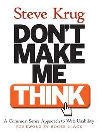
Finally, I saved some time to read this very useful and quite short book! This book of Steve Krug, web usability expert and consultant, is a nice way to find simple tips to check you website with fresh eyes and easily pinpoint what should be improved and how final users may think it’s improvable (user-oriented)! And also, it has great guidelines for a revamp or website creation.

The subheadline of this book “A Common Sense Approach to Web Usability” is fully adequate to what it is :). It’s mostly basic stuff but most of those basics are so basic that we tend to overfly them. Reading this book, remind me 2 principles : “Back to the Basics” & “Keep it simple, s“.

In this first article about this book, I’ll go through what I think should be remembered from the first 6 chapters (half of the entire book) in 10 points. Sorry if sometimes, it feels pretty obvious but nevertheless even the obvious is good to be remind of!

Knowing that when we/people use the web:

      ~ People scan web page and do not read all the content of a web page
      ~ People are looking for keyword because we (people) know we dont need to read everything we are just reaching for what we are looking for
      ~ When browsing, people dont search for the best option but for the most reasonable option
      ~ We muddle through as we don’t care about understding, we care about getting to our point

Here are my 10 usabilty guidelines:

      1. Copy, Call-to-action, Headline… : Make it obvious, self evident or at leat self explanatory!
      2. Create a clear visual hierarchy: the more important = the more proeminent
      3. Create a clear visual hierarchy: things related logically are related visually (color, font…)
      4. Use conventions: make it obvious that a call-to-action is clikable | Keep the visual noise down
      5. No needless word get rid of 3/4 of your content
      6. Navigation: give the user something to hold on. Good navigation give us confidence in the website builder
      7. Follow the conventions: Persistent navigation must be including return home, search box, login, category…
      8. Follow the conventions: This persistent navigation should be everywhere exept homepage & checkout
      9. Every page need a name, the name should be the same as the link which take the user on the page or at least match maximum keyword
      10. Exercise… Quick test for a good navigation: At a glance on your pages, Answer to:
      – What’s the site id (logo)
      – On which page am I (page name)
      – What are the major section of the website
      – What are my navigation option at this level
      – How can I search

If you want to go deeper, and you should, read this book: Don’t Make Me Think – A Common Sense Approach to Web Usability. And you can also wait for Part 2 of this article!