2013 Digital Analytics Roadmap

2013 Digital Analytics Roadmap

Scroll down for a larger version
Analytics Roadmap
Happy New Year everyone!
Let’s kick off this year with a list of wishful thinking and future articles, I certainly hope I will be able to work deeply on all those subjects and more but I do realize that not everything will be achievable !
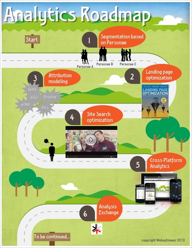
I am sharing this list as I intend to write about all those topics this year, so stay tuned if one those items – segmentation, landing page optimization, cross-platform analytics, campaign performance measurement, site search… – is a previous, present or future topic of interest.


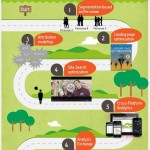
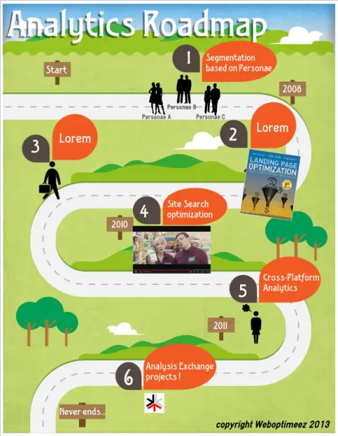
  1. Segmentation based on Personae

    In a recent article, When Analytics is King, Segmentation and Targeting are Queens, I was giving my opinion on how important segmentation is to do a better analytics job. There is various ways of doing segmentation and one of the efficient one is to based your audience segmentation on personae. Personae concept goes beyond demographic segmentation, I will soon dive deeper into this subject in the meantime, this article helps to understand the usage of personae in digital marketing.

  2. Landing page optimization : almost there…

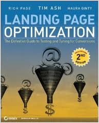
    This topic is very large, my objective here is to finish Tim Ash’ book: Landing Page Optimization: The Definitive Guide to Testing and Tuning for Conversions, this book covers how to prepare all types of content for testing, how to interpret results, recognize the seven common design mistakes, and much more.(Amazon quote). I start reading it few weeks ago, it’s a highly valuable book, can’t wait to share with you a full review of it.


  3. Attribution Modeling & Testing : How to improve campaign allocation performance measurement ?

    Hopefully, performance improvement is a journey, not a destination. When it comes to digital marketing and campaign budget allocation, the equation gets more and more complex as the channels are numerous (Search, Display, Facebook etc.) and understanding each channel contribution to your performance (revenue, micro conversions, user experience…) is a tough job. Attribution models and testing is a step in this journey.

  4. SiteSearch Optimization


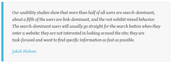
    This hilarious video of Google Analytics reminds me, how important site search is, I remember reading in a usability study that approx. 30% of your visitors will ignore your navigation, content links and hero images and use ONLY your internal search tool to look for what they are searching.

    Well, I do hate common views however this one worth taking the time to dig a little deeper and capture the main metrics to help your visitors find what they are looking for in your website in a efficient way.

  5. Cross-Platform Analytics

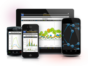
    A few articles this month claims : 2013 is the year of mobile analytics or 2013 is still not the year of mobile analytics, 2013 is the year of … Well, i don’t really care as the platform of today is certainly the old man of tomorrow’s platform. So I want 2013 to be the year of cross platform analytics : mobile, tablets, desktop, Tv… Whatever ! Where your clients/prospects are, you want to be looking at!
    About that, I wish to use and write about and compare those unified audience cross-platform audience measurement tools :
    Media Metrix® Multi-Platform from comScore
    Universal Analytics from Google Analytics

  6. Participate as much as possible to Analysis Exchange

    I joined the Analysis Exchange as a mentor last year, I didn’t have the chance to participate yet, well I hope that 2013 will be the year of my contribution. This exchange is a pretty exiting project run by Web Analytics Demystified to increase practice of web analytics by providing free web analytics consulting to non-profits and NGOs around the world.

Thanks for reading so far ! If you liked this article please spread the love…
How NOT to “I want to do this, so I’ll find data to support my goal”

How NOT to “I want to do this, so I’ll find data to support my goal”

As a webmarketer and/or analyst, we sometimes persuade ourselves by a GREAT marketing idea:

  • ~ Develop a new design for a landing page, a product page, a checkout…
  • ~ Spend more budget on a channel
  • ~ Implement a new payment method
  • ~ Add more testimonials or security seals
  • ~ Use a one-page ajax based form
  • ~ Use video on a landing page

Tempting huh…

Sometimes you come across an idea, an idea that from your point of view will enhance your user experience, the lead generation, the checkout conversion rate, the engagement onsite… And sometimes, people don’t get it. Because they think it’s too fancy, time-consuming, not goal-oriented or whatever reasons to turn down your proposal. Then you either give up your idea because people counter-arguments convince you or you can get stubborn and decide to show them by any cost.
From this starting point, you will dig hard into the data to pull any insight which confirm your feeling and resent any data that do not get along with your way. You will try to prove that you have a data-driven proposal.
It’s hard to tell when the cost is too high. When the data that you are presenting are no longer objective but just proving you right.

How to avoid this?
Here are 5 tips, I try to use when I’m wondering if I am crossing the line or when I get the deeply sceptical look from my colleagues:

1. Ask your users via online surveys

To stay one step ahead, we need to be proactive and not rely only on what our users show us they want. It can also be the other way. If we are talking about a major idea, why not asking you end users what they think about ? A simple quick online survey for example. If you get a massive yes from your end users, it will be much easier to convince your boss/clients/colleagues.
Online surveys are not cost-free but using a platform like SurveyMonkey or SurveyGizmo can save you a lot of money.


2. Test it first !

You can either decide to test it live or test only your mockups (Verify is a nice tool for mockup, design testing). Either way, it’s unlikely that changing or adding something new without any testing first will be a success. Imagine you are working on a landing page new template, with Test and Target or Google Content Experiments (ex. Google Website Optimizer) you can easily decide to set an AB Test only for 30% of your traffic- with Omniture Test and Target you can easily target further (returning visitor only, chrome visitor only, exclude Sunday visitors…)

3. Within the data: look for insights to prove you right & wrong.

By looking for reasons to do or not to do it, you may find some unexpected insights to specify you idea, reorient it or even cancel it. You could realise that your idea is workable only for a specific target or that it could alter the current flow of your users…

4. Ask your peers (but maybe not from your company)

Consult your peers, ask them if they already come across this idea and how they deal with. Look for online case study about this feature, technology, new channel… you are thinking about. Check for information about deployment, return on investment, survey… It’s possible that someone had this idea before and if they had it’s comforting to dig more about this!

5. Implement a framework for your campaign, new feature… with predefined metrics & KPI


If you know from even before you think of a new idea how-to measure it and stick to this framework (e.g a framework for a social media campaign), you will not be tempted to create from scratch metrics & KPI that will only prove you right.
Fore sure, each case will deserve some specific metrics but most of the time you have unavoidable core business metrics.

You may not need or have the resources to do it all but going through this process should help you to stay objective when presenting the data that will convince or not you client/boss/colleagues to push this idea on the top priority list.

In a ideal world this would not be happening, as what we “marketers/analysts” want to do is what our end-users, customers want to see. Nothing to fight for there but in the real world we want to do crazilicious, funny stuff not always user-oriented sometimes tech-oriented to content our geeky side, sometimes pushy business oriented to content our wallet, sometimes trendy-oriented to content our early-adopters side…
Sad but true, sometimes users want “boring” stuff as long as it is effective and useful for them that should work BUT hopefully sometimes users don’t know that your idea is actually what they are looking for.

What about you ? How do you deal with that, do you have any tips to avoid pulling data to prove you right?

Don’t make me think! Few simple and concrete web usability principles – Part 2

The 2nd half of the book and so the 2nd part of my article deals with the following subjects:

      1. How to get the best of your homepage design ?
      2. Why, When and How conduct usability testing?
      3. User-friendliness and Accessibility


Like in the 1st article, I’ll try to briefly expose what should be remembered from this book. It may not be 100% loyal to the book, 1st because of my interpretation and 2nd because I also express my own point of view.

1. How to get the best of your homepage design ?

Even if your homepage is not the first page that user will get through – it’s commonly known that an entry page is not always homepage, and the less it is the better as your landing page should be reflecting the path the user used to access your website.
Anyway, the homepage is still the page a user will go through during the navigation to have an overall impression, to look for guidance, to restart his navigation… That’s mainly why you need to make sure that on the homepage, people get it!
Here is what they should get:

      – an homepage should give the website identity and mission : a logo and an tagline should be enough – make it clear, short and it should convey differenciation and benefits
      – an homepage should show the website hierarchy : your navigation
      – an homepage should allow to search through a search box, shortcuts, teases and deals
      – an homepage should allow users to complete primary goals (sign up, registration to newsletter, fill a form for a free trial, …)

Your homepage should stay concise and understandable for any users and answers those:

      – what is this site?
      – what do they have?
      – what can I do here ?
      – why should I be here and not somewhere else?

The design of a website especially the homepage and main pages could be a very frustrating and conflicting process. Each team: design, IT, marketing, stakeholders, CEO… want to be a part of it which is certainly a good thing but when you get to a conflict of opinion – which may happen on every feature, every pixel, every color… “who hold the truth?“.
Hopefully, I can answer to this question : “Nobody” pfiouuuu, that’s a relief!

Nevertheless, the real question should be :”How can we realise this feature to provide a good user experience to our web users”. I would say by asking the web users their opinion & testing. This bring us to :

2. Why, When and How conduct usability testing?

I kind of already answer to the Why question, but let’s sum up the reason why you should conduct a usability testing:
Mostly because, using usability testing will improve your revenue through enhancing customer satisfaction & retention, but also:

      – if you want web users to complete the goals you have in mind when building your website, better to ask them directly if they get it or not! (the purpose, the value proposition, the concept, how it works…)
      – if you think that web users will use your website the way you build it for: you’re wrong!
      – if you want to avoid endless discussion with your team, please ask the web users to settle this for you
      – if you think that you are objective (and you’re better not be…): you’re wrong!
      – if you think this is useless: try once with neighbours, friends or anybody to browse the same website (with a similar goal for all : like buy a pair of Nike on Ebay for instance) and watch! You’ll be amazed!
      + it’s easy and fun to do

How not to do usability testing... (Image credit: blog.templatemonster.com)

First of all some guidelines of usability testing concept from Jakob Nielsen and a definition from Wikipedia:

Usability testing is a technique used in user-centered interaction design to evaluate a product by testing it on users. This can be seen as an irreplaceable usability practice, since it gives direct input on how real users use the system.


Here are few guidelines for testing:

      the sooner in your process the better
      – testing with one web user one is better than nothing
      – testing is an iterative process
      – 3 to 5 users is enough
      – don’t hold the testing because of problem to find the perfect tester- take “anybody” to test “if your grandma can use it an expert/ targeted audience will do”
      + most of all here the Steve Krug’s guide to conduct your testing.

1 rule that I think would be amazingly great, useful and revenue oriented: “Each web dev team should make once morning a month a usability testing and debrief over lunch”.

To conclude about usability testing, I think it’s really a great tool to increase user satisfaction and thus revenue, which finally is the goal in a ecommerce website :). Using usability testing is one tool among others, like AB Testing, Focus group, Card sorting… but each tool have a “perfect timing” during the process of building or enhancing your website.
This leads me to conclude on:

3. User-friendliness and Accessibility

Few guidelines to “behave” and make your web users happy:

      – don’t ask for useless or really annoying form fields: this will lead the users to ask himself why are you asking him those informations and either he will lie or he will quit
      do not hide informations from the users: anything you would want to hide thinking that you can “trick” the web user in filling in registration form first, hold it!
      – no marketing only flash slide intro… which get on the user way to accomplish something
      – do not punish the user for not filling exactly how you think they should – for instance don’t erase all the credit card information because the cardholder name is missing (you should adapt to the web user not the opposite)
      do everything to make the web user navigation on your website easy!

Accessibility meaning that people with disabilities can use the Web is considered as part of usability.
I’ll not dig into too many details for this part as there are already a lot of guidelines online about this subject and the rules to follow.
Nevertheless here is a quick list, you can follow:

      make things usable for everyone will help users w/ disabilities (fixing common issues)
      – use CSS and allow your text to resize
      add alt text to every image & link
      – make your forms work with screen readers
      – make all content accessible by keyboard
      – use client-side image map

That’s it for today (and for the book also)!
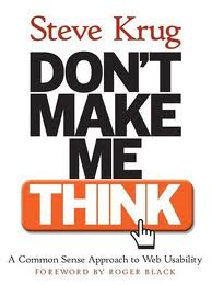
You can go on with reading the following book of Steve Krugs “Rocket Surgery Made Easy” (focus on Usability Testing) and also follow his work on www.sensible.com.

From my point of view, this book is a good reminder of a lot of usability guidelines we easily forget and also a great great guide to do some usability testing! I hope this will help you too and lead you to pick some tips, buy the book or conduct some usability testing!

Usability Testing : Card sorting ou Tri de cartes

[:fr]Methodologie Tri de cartes La refonte de votre site web s’impose ? Vous vous interrogez sur la structure de l’information de votre futur site web ? La navigation de votre site est surchargée ? Vous cherchez un moyen d’améliorer l’expérience utilisateur sur votre site ?…

Les avis en interne pour ce genre de questions sont en général légions et pour ne pas finir en guerre de tranchées ou être contraint de se plier a l’avis de l’HIPPO , une méthodologie différente du brainstorming interne s’impose.

Avez-vous déjà essaye le tri de cartes ? Si non, voici pourquoi vous devriez l’utiliser :
#1 : Il s’agit d’une méthodologie user-oriented
#2 : C’est simple et peu couteux a mettre en place
#3 : C’est reconnu et fiable : si Jakob Nielsen, le dit…
#4 : C’est ludique (oui, c’est un argument 🙂 !)

Qu’est ce que la methodo du tri de cartes ?
Il s’agit d’une méthodologie qui consiste a demander a l’utilisateur final d’organiser les contenus de votre site, qui auront été labellises séparément sur chacun une carte au préalable, en fonction de la façon dont il voit les choses.
Cette technique vous permet de voir l’architecture de l’information telle qu’elle devrait être selon l’utilisateur final – bien sur, il ne s’agit pas de la reprendre tel quelle mais de s’en inspirer et d’avoir un aperçu de comment l’utilisateur va utiliser votre site. Et aussi, cette technique va vous permettre de tester les labels et les améliorer en fonction du degré de compréhension de vos testeurs.

Comment ça marche le tri de cartes ? 2 méthodes :
Le tri de cartes ouvert qui consiste a donner les cartes aux testeurs sans aucune notion d’architecture primaire du site.
Le tri de cartes ferme qui consiste a donner les cartes aux testeurs avec les grandes catégories primaires pré-etablies.

Le choix entre ces 2 méthodes va dépendre de l’état d’avancement de votre projet et surtout de vos objectifs : pour une création de site, j’aurais tendance a rester ouvert puis a fermer dans un deuxième temps pour gagner en précision et pour une refonte ou l’ajout de nouvelles catégories, j’opterais pour la technique fermée.

La mise en place du test :
# 15 personnes (Card Sorting: How Many Users to Test), 5 groupes de 3 personnes
# Tester les labels avant de tester l’architecture
# 30 a 100 cartes
# la modération du jeu est a ne pas négliger : ne pas laisser un participant prendre le lead sur les autres, s’assurer que chaque utilisateur puisse dire ce qu’il a a dire…
# l’analyse du test est time-consuming mais a prendre avec serieux

Y’a plus qu’a tester !

[:en]
Your website is dying for a revamp, redesign? You need to determine the most suitable web structure? The navigation of your site is overloaded? Looking for a way to improve the user experience on your website? …

Internal opinions about those questions can be overwhelming and if you do not want to end up in warfare or to be compelled to bow to the opinion of the HIPPO, a different methodology from internal brainstorming is advised.

Have you tried the card sorting methodology ? If not, here’s why you should give it a try:
# 1: This is a user-oriented methodology
# 2: It’s simple and inexpensive to implement
# 3: It’s recognized and reliable: if Jakob Nielsen, says …
# 4: It’s fun (yes, that’s an argument:)!)


What is the methodology of card sorting?

The process involves users to sort a series of cards, each labeled with a piece of content, into groups that make sense to them.
This methodology leads you to understand the organisation of your content as it should be according to your final users – of course you should not just copy/paste the results, but you should get inspiration from there and it will give you a overview of how the user will use your site, for real. Also, this technique will allow you to test the labels/your copy and improve the degree of understanding of your testers.

How does card sorting work? Two methods:
Open Card Sorting: users by group of 5 are given cards showing site content with no pre-established groupings, no notion of primary architecture of the site.
Closed Card Sorting: users by group of 5 are given cards showing site content with the primary architecture of the site.

The choice between these two methods will depend on first your goals then the progress of your project. For example if your are creating a new a website, I would tend to stay open and then use closed technique to increase accuracy and regarding redesign or addition of new categories, I would opt for the closed technique.

The implementation of the test:
# 15 people (Card Sorting: How Many Users to Test), 3 groups of 5
# Test labels before testing architecture
# 30 has 100 cards
# Moderation is to keep in mind: do not allow a participant to take the lead over the others, ensure that each user can say what they want to say…
# Analysis of the test is time-consuming but to be taken seriously

Time to try it !

Acquisition & Conversion

[:fr] Il est intéressant de voir que certains spécialistes du CRO (conversion rate optimization) voit leur avenir / argumentaire client dans une bataille contre l’acquisition… Je lis régulièrement que l’acquisition est une “perte d’argent, dépenses inconsidérées pour ameuter du trafic a peine ciblée !
J’aurais tendance a penser que nous sommes complémentaires et certainement pas en opposition, il est vrai néanmoins qu’il est rageant de savoir que les dépenses sont concentrées en Acquisition et que la Conversion est pour le moment encore méconnue et mise de coté…
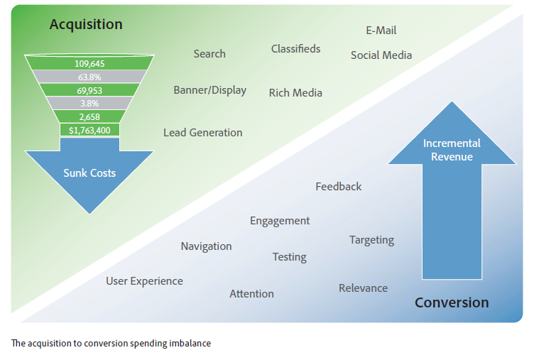
Je pense que le mot clé ici est méconnue et pour y remédier a mon degré voici une illustration et un peu de lecture qui, selon moi – mets les mots sur ces 2 métiers et peut contribuer a éclaircir la profession du CRO.

Cette illustration a pour origine le Whitepaper d’Adobe + John Lovett : The online conversion imperative.

[:en] It is interesting to notice that some CRO (conversion rate optimization) specialists see their future / pitch to convince in a battle against the acquisition (PPC, Dispaly, affiliate network…). I often read that the acquisition is a “waste of money, useless spending to gain traffic not even targeted!”
I have a tendancy to think that we are complementary and certainly not in opposition, it is nevertheless true that it is discouraging to know that most of the spending is focused in acquisition (PPC for ex.) and that conversion is still misknown at this time and set aside …
I think the keyword here is misknown and here is an illustration + whitepaper, that through my point of view, helps to clarify this debate.

This figure comes from the Adobe + John Lovett last whitepaper: The online conversion imperative.