How NOT to “I want to do this, so I’ll find data to support my goal”

How NOT to “I want to do this, so I’ll find data to support my goal”

As a webmarketer and/or analyst, we sometimes persuade ourselves by a GREAT marketing idea:

  • ~ Develop a new design for a landing page, a product page, a checkout…
  • ~ Spend more budget on a channel
  • ~ Implement a new payment method
  • ~ Add more testimonials or security seals
  • ~ Use a one-page ajax based form
  • ~ Use video on a landing page

Tempting huh…

Sometimes you come across an idea, an idea that from your point of view will enhance your user experience, the lead generation, the checkout conversion rate, the engagement onsite… And sometimes, people don’t get it. Because they think it’s too fancy, time-consuming, not goal-oriented or whatever reasons to turn down your proposal. Then you either give up your idea because people counter-arguments convince you or you can get stubborn and decide to show them by any cost.
From this starting point, you will dig hard into the data to pull any insight which confirm your feeling and resent any data that do not get along with your way. You will try to prove that you have a data-driven proposal.
It’s hard to tell when the cost is too high. When the data that you are presenting are no longer objective but just proving you right.

How to avoid this?
Here are 5 tips, I try to use when I’m wondering if I am crossing the line or when I get the deeply sceptical look from my colleagues:

1. Ask your users via online surveys

To stay one step ahead, we need to be proactive and not rely only on what our users show us they want. It can also be the other way. If we are talking about a major idea, why not asking you end users what they think about ? A simple quick online survey for example. If you get a massive yes from your end users, it will be much easier to convince your boss/clients/colleagues.
Online surveys are not cost-free but using a platform like SurveyMonkey or SurveyGizmo can save you a lot of money.


2. Test it first !

You can either decide to test it live or test only your mockups (Verify is a nice tool for mockup, design testing). Either way, it’s unlikely that changing or adding something new without any testing first will be a success. Imagine you are working on a landing page new template, with Test and Target or Google Content Experiments (ex. Google Website Optimizer) you can easily decide to set an AB Test only for 30% of your traffic- with Omniture Test and Target you can easily target further (returning visitor only, chrome visitor only, exclude Sunday visitors…)

3. Within the data: look for insights to prove you right & wrong.

By looking for reasons to do or not to do it, you may find some unexpected insights to specify you idea, reorient it or even cancel it. You could realise that your idea is workable only for a specific target or that it could alter the current flow of your users…

4. Ask your peers (but maybe not from your company)

Consult your peers, ask them if they already come across this idea and how they deal with. Look for online case study about this feature, technology, new channel… you are thinking about. Check for information about deployment, return on investment, survey… It’s possible that someone had this idea before and if they had it’s comforting to dig more about this!

5. Implement a framework for your campaign, new feature… with predefined metrics & KPI


If you know from even before you think of a new idea how-to measure it and stick to this framework (e.g a framework for a social media campaign), you will not be tempted to create from scratch metrics & KPI that will only prove you right.
Fore sure, each case will deserve some specific metrics but most of the time you have unavoidable core business metrics.

You may not need or have the resources to do it all but going through this process should help you to stay objective when presenting the data that will convince or not you client/boss/colleagues to push this idea on the top priority list.

In a ideal world this would not be happening, as what we “marketers/analysts” want to do is what our end-users, customers want to see. Nothing to fight for there but in the real world we want to do crazilicious, funny stuff not always user-oriented sometimes tech-oriented to content our geeky side, sometimes pushy business oriented to content our wallet, sometimes trendy-oriented to content our early-adopters side…
Sad but true, sometimes users want “boring” stuff as long as it is effective and useful for them that should work BUT hopefully sometimes users don’t know that your idea is actually what they are looking for.

What about you ? How do you deal with that, do you have any tips to avoid pulling data to prove you right?

5 scary facts & stats about UX & Ecommerce I learned those past weeks

Only 3% of the websites are judged satisfying in term of usability from a user point of view…

You may have heard of the results from Forrester Website usability report March 2012, well it’s a little depressing to know that so few users are satisfied when browsing a website. Despite the fact that it’s common mistakes since 10 years that we, web marketers, developers, webmaster… do, it can also be encouraging to know that the edge of improvement is huge. I would recommend more than anything the book I just finish and to make it short both articles I wrote about it Few simple and concrete web usability principles. If there is just one thing I would remind, it will be “If your grandmother can use it, then any expert/targeted audience you have will be able to use it…”

80% of customers abandon a mobile site if they have a bad user experience.


Well that sounds quite normal! As we know that mobile browser user are supposed to be more demanding, we must find a way to meet their expectations so which way will be the better : mobile first? responsive design? mobile app, mobile-tablet-any device site?… well, I think the discussion is still going on. You may know my position on the subject, I tend to believe that the responsive design although being hard-work, is the better we can offer for user experience. Anyway, as I was saying : the discussion is still on the flow: check the latest hot topic “Designers respond to Nielsen on mobile” since Jakob Nielsen last alertbox

At least 59% of potential web shoppers abandon their shopping cart


For sure, the checkout abandon rate improvement is on of the common most and revenue-driven subject, we webmarketers work on. Aside from the subjects, I went through with others articles: How-to track your checkout conversion rate or Best practices to decrease abandon rate, here are some new tips I found from the E-commerce Usability Survey study by Baymard Institute 2011. This 148 pages report is really complete but I’ll not be able nor allowed to give away all the tips here. Let me just sum up the 6 categories that the report go through to help us enhance the checkout process:

      Data input (any kind of data input the customer must enter during checkout): this part is mostly about form usability. As ressources, I’ll advise Luke Wroblewski reading: either his book Web Form Design: Filling in the Blanks (not so free) or his writings 100% FREE
      Copywriting : the use and wording of text throughout the checkout process. I would briefly say: be clear and concise & careful to your call-to-action
      Layout: the visual layout of the checkout pages. This part is clearly about design and usability: “be consistent and clear in you visual hierarchy, the more important the more proeminent and keep the visual noise down”
      Navigation: the implementation of process steps, buttons, and navigational links.
      Flow: the flow between the individual process steps. This part give some guidelines to avoid customer confusion during the process : “having steps within steps confuses and intimidates
      customers as it breaks with their mental model of a linear checkout”.
      Focus: the site’s own business benefits vs. the customer’s shopping experience. This one is a “How-to make you web user life easy|happy OR Stop annoying your web users with your point of view or your needs.”

Access the whole survey here.

70% of shoppers use their smartphone while shopping in the store

Source: The Mobile Movement Study, Google/Ipsos OTX MediaCT , Apr 2011
This fact is not really scary but for cross channel business it’s a significant data. It’s a significant info to know that in-store people rely both on your sales person and customers online reviews to make a decision! It’s useful to know that while browsing to get information people could find any information (promotion, bad reviews…) and leave your store… This make an echo to “WINNING THE ZERO MOMENT OF TRUTH”. The way we shop is definitely changing : multiple device, multiple channel, multiple source of informations…

A 1 second delay in page response can result in a 7% reduction in conversions.


This one is not new but really a crazy fact, check here a great infography to understand how significant it can be“How Loading Time Affects Your Bottom Line. And if you do not use it already, install Page Speed (Firebug extension) or test your website with the Google Tool : Page Speed & finally track it continuously in Google Webmaster Tools as Page Speed beign a user experience matter but also a SEO matter.

I know this sound terribly depressing… NO, it’s not! It’s challenging! Sorry I’m an eternal optimistic…

I hope the few links I shared will help if you get to work on of this challenge and if not you may start.

Don’t make me think! Few simple and concrete web usability principles – Part 2

The 2nd half of the book and so the 2nd part of my article deals with the following subjects:

      1. How to get the best of your homepage design ?
      2. Why, When and How conduct usability testing?
      3. User-friendliness and Accessibility


Like in the 1st article, I’ll try to briefly expose what should be remembered from this book. It may not be 100% loyal to the book, 1st because of my interpretation and 2nd because I also express my own point of view.

1. How to get the best of your homepage design ?

Even if your homepage is not the first page that user will get through – it’s commonly known that an entry page is not always homepage, and the less it is the better as your landing page should be reflecting the path the user used to access your website.
Anyway, the homepage is still the page a user will go through during the navigation to have an overall impression, to look for guidance, to restart his navigation… That’s mainly why you need to make sure that on the homepage, people get it!
Here is what they should get:

      – an homepage should give the website identity and mission : a logo and an tagline should be enough – make it clear, short and it should convey differenciation and benefits
      – an homepage should show the website hierarchy : your navigation
      – an homepage should allow to search through a search box, shortcuts, teases and deals
      – an homepage should allow users to complete primary goals (sign up, registration to newsletter, fill a form for a free trial, …)

Your homepage should stay concise and understandable for any users and answers those:

      – what is this site?
      – what do they have?
      – what can I do here ?
      – why should I be here and not somewhere else?

The design of a website especially the homepage and main pages could be a very frustrating and conflicting process. Each team: design, IT, marketing, stakeholders, CEO… want to be a part of it which is certainly a good thing but when you get to a conflict of opinion – which may happen on every feature, every pixel, every color… “who hold the truth?“.
Hopefully, I can answer to this question : “Nobody” pfiouuuu, that’s a relief!

Nevertheless, the real question should be :”How can we realise this feature to provide a good user experience to our web users”. I would say by asking the web users their opinion & testing. This bring us to :

2. Why, When and How conduct usability testing?

I kind of already answer to the Why question, but let’s sum up the reason why you should conduct a usability testing:
Mostly because, using usability testing will improve your revenue through enhancing customer satisfaction & retention, but also:

      – if you want web users to complete the goals you have in mind when building your website, better to ask them directly if they get it or not! (the purpose, the value proposition, the concept, how it works…)
      – if you think that web users will use your website the way you build it for: you’re wrong!
      – if you want to avoid endless discussion with your team, please ask the web users to settle this for you
      – if you think that you are objective (and you’re better not be…): you’re wrong!
      – if you think this is useless: try once with neighbours, friends or anybody to browse the same website (with a similar goal for all : like buy a pair of Nike on Ebay for instance) and watch! You’ll be amazed!
      + it’s easy and fun to do

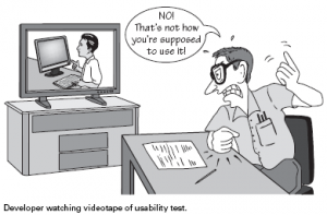
How not to do usability testing... (Image credit: blog.templatemonster.com)

First of all some guidelines of usability testing concept from Jakob Nielsen and a definition from Wikipedia:

Usability testing is a technique used in user-centered interaction design to evaluate a product by testing it on users. This can be seen as an irreplaceable usability practice, since it gives direct input on how real users use the system.


Here are few guidelines for testing:

      the sooner in your process the better
      – testing with one web user one is better than nothing
      – testing is an iterative process
      – 3 to 5 users is enough
      – don’t hold the testing because of problem to find the perfect tester- take “anybody” to test “if your grandma can use it an expert/ targeted audience will do”
      + most of all here the Steve Krug’s guide to conduct your testing.

1 rule that I think would be amazingly great, useful and revenue oriented: “Each web dev team should make once morning a month a usability testing and debrief over lunch”.

To conclude about usability testing, I think it’s really a great tool to increase user satisfaction and thus revenue, which finally is the goal in a ecommerce website :). Using usability testing is one tool among others, like AB Testing, Focus group, Card sorting… but each tool have a “perfect timing” during the process of building or enhancing your website.
This leads me to conclude on:

3. User-friendliness and Accessibility

Few guidelines to “behave” and make your web users happy:

      – don’t ask for useless or really annoying form fields: this will lead the users to ask himself why are you asking him those informations and either he will lie or he will quit
      do not hide informations from the users: anything you would want to hide thinking that you can “trick” the web user in filling in registration form first, hold it!
      – no marketing only flash slide intro… which get on the user way to accomplish something
      – do not punish the user for not filling exactly how you think they should – for instance don’t erase all the credit card information because the cardholder name is missing (you should adapt to the web user not the opposite)
      do everything to make the web user navigation on your website easy!

Accessibility meaning that people with disabilities can use the Web is considered as part of usability.
I’ll not dig into too many details for this part as there are already a lot of guidelines online about this subject and the rules to follow.
Nevertheless here is a quick list, you can follow:

      make things usable for everyone will help users w/ disabilities (fixing common issues)
      – use CSS and allow your text to resize
      add alt text to every image & link
      – make your forms work with screen readers
      – make all content accessible by keyboard
      – use client-side image map

That’s it for today (and for the book also)!
You can go on with reading the following book of Steve Krugs “Rocket Surgery Made Easy” (focus on Usability Testing) and also follow his work on www.sensible.com.

From my point of view, this book is a good reminder of a lot of usability guidelines we easily forget and also a great great guide to do some usability testing! I hope this will help you too and lead you to pick some tips, buy the book or conduct some usability testing!

Tracking checkout conversion rate with Google Analytics or Omniture Site Catalyst

About conversion rate, I would like in this article to dig a little deeper into checkout conversion rate and how to measure it. Currently, I’m doing an AB Test to compare the performance between a classic step-to-step checkout with a less classic “accordion checkout” (not to be confonded with one-page checkout).
Few things to define before talking about tracking with either Google Analytics or Omniture Site Catalyst.

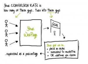
1. Conversion rate

Well, this design should do the trick

Conversion Rate illustration
Illustration from the great great Conversion Rate Experts blog

Our subject being checkout, we will assume that the website is an ecommerce one and as a consequence the main goal/action we want the user to take here is “placed an order”.

2. AB Testing

Also here i think an illustration will express it better than words

Few words about the AB testing subject here.


3. Checkout ergonomy and design

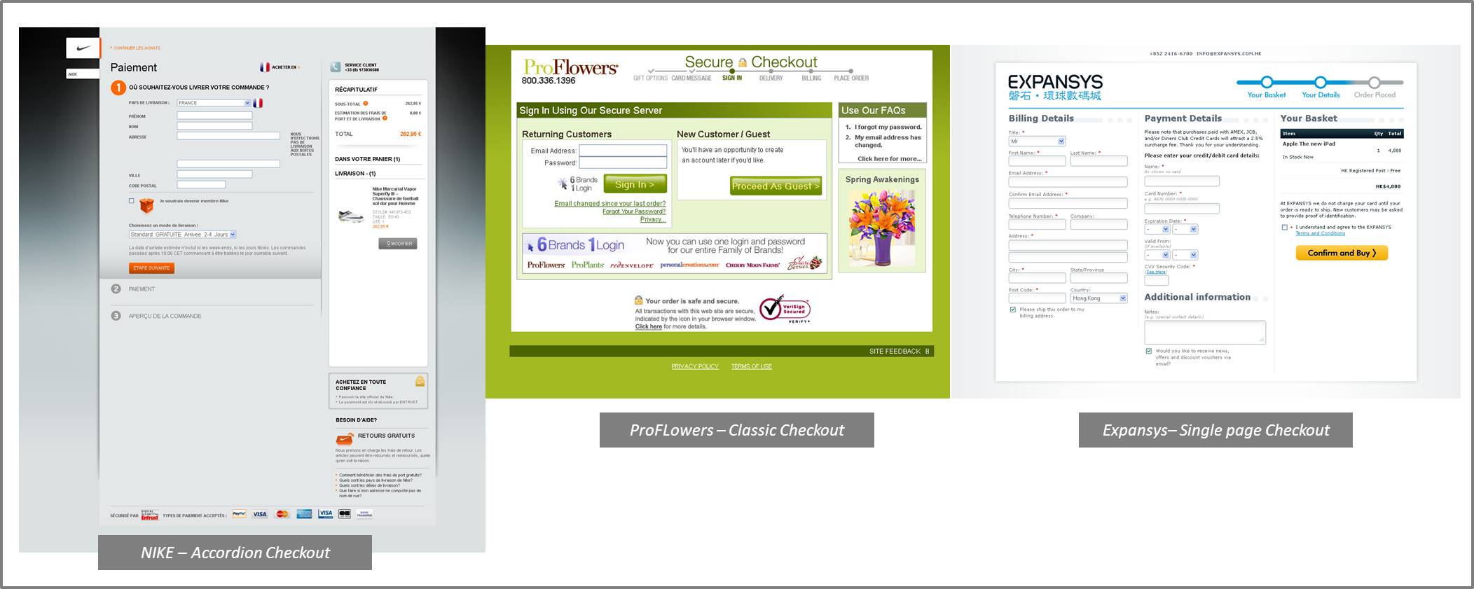
Just want to highlight the difference between : accordion checkout, classic step-to-step checkout and one page checkout. The checkout being the step just after the basket, not to be considered lazy but once again examples is better than words:

  1. Accordion checkout: Following the principle of an accordion, this kind of design hide and show the step following the user progression without leaving the page, it’s a “vertical” design using Ajax most of the time. When the user is taken to the checkout the first section is open and he can see the titles of the following sections just below.
  2. Classic checkout: The classic checkout is more a “horizontal” design, each step of the checkout = one dedicated page.
  3. Single Page Checkout: This kind of checkout design can be horizontal or vertical, the principle here is having everything on the same page and every fields open, better option for short checkout process > everything is visible at a glance.

Context being clear now, lets get quickly to measurement! First of all, most of the checkout being in multiple steps – whatever the kind of design you choose – I would advise to measure 3 things:

  1. Checkout conversion rate = sales / number of carts initiated
  2. Overall conversion rate = sales / unique visitors
  3. Fall out step by step = % of visitors who drop on each step
  4. The 2 first performance indicators can show you trend and the 2nd expecially allow you to compare your rate to market conversion rate: knowing that the formulas can depend but either way the 2nd formula is supposed to be the one the market use and communicate about.

    The fall out indicator is the one you should/could take more time to analyse and set up on your webanalytics tool.

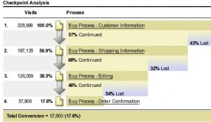
    With Google Analytics

    You first have to set up your goal. In our case, you goal is the last page of the checkout, usually the Thank You page then you have to set up the funnel which is each page/section of your checkout process. This is useful only if your checkout is a multiple page checkout : new step = new page. For one page checkout or accordion checkout, I would implement events tracking to get info about the steps within the page, but I will dig into this in a later article. Here is what you should get from GA:

    Why do I love Google Analytics: because it’s flexible, any webmarketer can do this without involving development team!


    With SiteCatalyst

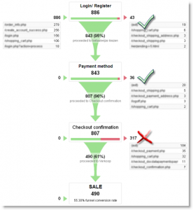
    You will first have to set the “pagename” in the tracking page properties. But most of the time, this should have been done when implementing Omniture SiteCatalyst the first time. With this, it’s also really easy and flexible as you just have to drag and drop your pagename into the “Fall out report” to build your report!
    Here is what you will get:
    What I do love about SiteCatalyst fallout report, is that you may need developement team help but you will be able to track PAGE and SECTION in a page so any kind of checkout design can be tracked!


    Well, tracking is the first step of optimisation: go this article to learn more about few tips to enhance your checkout flow and decrease your checkout abandon rate.

Don’t make me think! Few simple and concrete web usability principles – Part 1

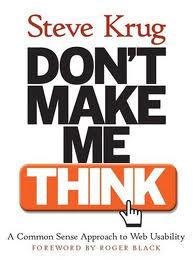
Finally, I saved some time to read this very useful and quite short book! This book of Steve Krug, web usability expert and consultant, is a nice way to find simple tips to check you website with fresh eyes and easily pinpoint what should be improved and how final users may think it’s improvable (user-oriented)! And also, it has great guidelines for a revamp or website creation.

The subheadline of this book “A Common Sense Approach to Web Usability” is fully adequate to what it is :). It’s mostly basic stuff but most of those basics are so basic that we tend to overfly them. Reading this book, remind me 2 principles : “Back to the Basics” & “Keep it simple, s“.

In this first article about this book, I’ll go through what I think should be remembered from the first 6 chapters (half of the entire book) in 10 points. Sorry if sometimes, it feels pretty obvious but nevertheless even the obvious is good to be remind of!

Knowing that when we/people use the web:

      ~ People scan web page and do not read all the content of a web page
      ~ People are looking for keyword because we (people) know we dont need to read everything we are just reaching for what we are looking for
      ~ When browsing, people dont search for the best option but for the most reasonable option
      ~ We muddle through as we don’t care about understding, we care about getting to our point

Here are my 10 usabilty guidelines:

      1. Copy, Call-to-action, Headline… : Make it obvious, self evident or at leat self explanatory!
      2. Create a clear visual hierarchy: the more important = the more proeminent
      3. Create a clear visual hierarchy: things related logically are related visually (color, font…)
      4. Use conventions: make it obvious that a call-to-action is clikable | Keep the visual noise down
      5. No needless word get rid of 3/4 of your content
      6. Navigation: give the user something to hold on. Good navigation give us confidence in the website builder
      7. Follow the conventions: Persistent navigation must be including return home, search box, login, category…
      8. Follow the conventions: This persistent navigation should be everywhere exept homepage & checkout
      9. Every page need a name, the name should be the same as the link which take the user on the page or at least match maximum keyword
      10. Exercise… Quick test for a good navigation: At a glance on your pages, Answer to:
      – What’s the site id (logo)
      – On which page am I (page name)
      – What are the major section of the website
      – What are my navigation option at this level
      – How can I search

If you want to go deeper, and you should, read this book: Don’t Make Me Think – A Common Sense Approach to Web Usability. And you can also wait for Part 2 of this article!