Well, 10 months later… I have been partially unfaithful to Google Analytics and I love it (no worries, I still love GA especially as they are improving the features every day since the V5).
Anyway, I use SiteCatalyst daily and really want to spread the love about 5 really great features that will daily help you to: save time, be more accurate & boost your conversion.
1. Calendar event
As marketer, we make modifications to our website very often, change promotions, test new design… if you handle one website it’s easy to remember – depending of how many modifications you’ve made – but when it comes to managing a dozen websites and multiple modifications, testing… it’s get messier.
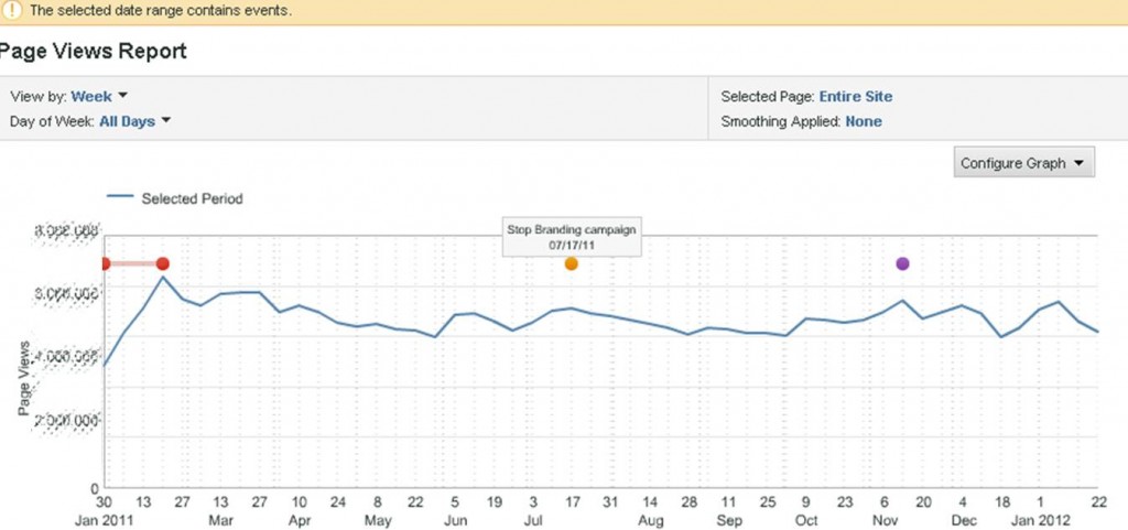
Calendar event feature help you to visually see the important events, campaigns… that happen to your website on SiteCatalyst reports.
I use Calendar event because, having a memory like a sieve, I prefer focusing my brain on analysing data than remembering what I may or may not have change during this period. And also, think at any stakeholder or colleagues who are checking the data, few are the odds that they will remember your testing plan.
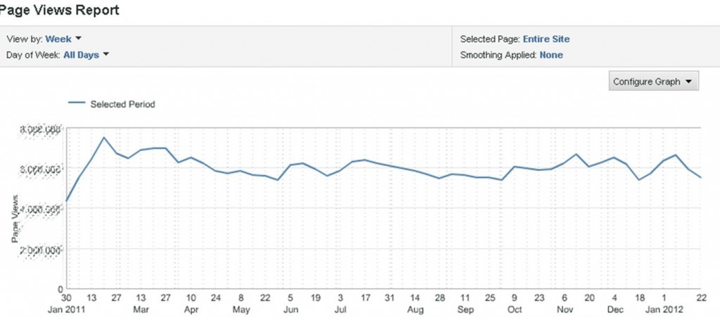
Let’s take for example the Page views report:
You may know why there is some up & down, which campaign you planned, for how long… but what about other users? Isn’t it more understandable like that:
Each event is represented by a line or a point that help you to remember each event. Now everyone can check the Page views report and focus on understanding the trend and each campaign effect not on understanding the graph.
2. Bubble Chart
As an excel fan, I love pivot table & chart. That’s why I love the bubble chart in SiteCatalyst. This chart allows you to check the relation between 3 different metrics in a single report.
For instance, in this Pages report – I can see, on a glance, for the top 5 pages (ranked by whatever metrics I want) the relation between 3 success events: visits, revenue & orders.
Each bubble represent a page, the bubble size is correlated to the volume of orders and visits and members are represented on axis. This is a good way to isolate a page which is having a different behaviour than expected.
The tricky & more valuable thing here is to choose the right metrics to compare as for a page: Visits, Page views & Entrances or for a product: Order, Revenue & Unit…
3. Participation metrics
This one is a really great feature to be more nuanced, subtle on data and be able to compare 2 point of views when looking at data. When measuring a success event, most of web analytics tools give more credit to the last place the action took place – and I’m not not talking about multi-channel attribution here, I ‘m focus on what’s happening inside your website. Participation metrics give full credit to every place the user went through before succeeding not only the last touch.
As in channel attribution logic, it’s common for users browsing your website to browse different page before achieving the goal we meant for them, and it would be too schematic to consider only the last touch. It happens a lot that some of our pages are not commonly a last touch but most of the time a page user would absolutely go through to succeed. No need to say how important it is to be aware of those pages.
No need to reinvent the wheel for this topic, as Adam Greco talk about this topic in much better words than I could ever do: Participation [Inside Omniture SiteCatalyst].
4. Target & Gauge reportlet
Very great tools to follow your marketing efforts and stay focus on your targets. We put a lot of our time in testing, trying to enhance the user experience, testing new campaign and marketing channel but we may miss sometimes to measure them and get a report that top management people would read.
As you may know “less is more” and when you send just a chart with some insights to the sponsor it’s really more effective than a detailed & accurate report (this doesn’t mean that you should not do it).
This become very handy when you use it on your dashboard: you just have to check your dashboard and… tadaaaa :
Just by looking at your gauge or target, you know if you need to dig further or just leave it alone. The gauge report on the left allows visually check your performance as you were checking a car fuel gauge (red being bad and green being good!). And the target report is quite the same, if your bar is red you are under your target!
5. Path reports
(especially combining fallout report w/ previous page report)
Finally the fallout report, which is a very useful report as you can easily check your conversion rate & check the efficiency of your funnels & talking about accuracy this report keep in mind that users are not using our website as robot, so if a user is going through a funnel and need to check something else during the process and come back to the funnel to complete it, this behaviour is still reported in it.
But I think this report become really powerful, when you get to analyse why user are leaving on a certain page in your funnel. And the next page report is where to get the answers that you would love to ask out loud : “Why are you leaving me, user? Where are you heading to? What have I done wrong? …”
Well, I hope those tips will be as helpful in daily routine as for me. I really love digging into data but it’s the analysing part that count more than doing report and I think that Omniture SiteCatalyst is doing a great job in helping us – web marketer, analyst… to get faster to analysing.
Even if, personally my user experience is still smoother on GA (cleaner design, more intuitive…) I think both tool are great.
What about you ? Was this useful ? What kind of tips do you use to gain time, be more precise… ?


